
NoBroker's Owner Plan offers assistance to property owners in listing their properties and finding tenants. With the expertise of a Relationship Manager (RM) and, in some plans, a Field Relationship Manager (FRM), owners can tackle challenges like setting the right price, uploading appealing photos, and managing property visits. This service streamlines the rental process, saving owners time and effort.
The Owner Plan aims to function as a personal concierge, simplifying the lives of property owners and providing assistance to those who may not have the capacity to manage their properties themselves.
My Role
I was actively involved in the entire process from ideation to development of the new version of the Paid Tenant Plan, collaborating closely with the Head of Design, Senior Project Managers, and company stakeholders.
Previous App
New App
The initial design was meant to be purely functional, built to perform the basic functions of the app and mainly rely on the relationship managers to handle the customers' needs
A newer and improved design to bring a more contemporary feel to the design, new logo, name and design direction with opportunity to improve UX and functionality of the old design


The Impact
The Paid Owner Plan stands out as a vital vertical for NoBroker, representing one of the primary profit-generating products for the company. Its performance holds substantial importance for both NoBroker and its investors. While the plan previously exhibited satisfactory performance with a basic design, the objective of the new design was to enhance several key performance indicators (KPIs). Notable achievements following the redesign include:
-
The number of users requesting property visits nearly tripled, resulting in almost double the successful schedules for tenants.
-
A significantly larger percentage of app users are now engaging in requesting visits, doubling from the previous version of the app.
-
Relationship managers now schedule only half as many visits as before, as users are taking on more scheduling themselves.
-
Calls to relationship managers from tenants have reduced by nearly half.
-
The average time taken to close on a property has decreased by nearly three weeks.
-
Daily active users have doubled, indicating a substantial increase in app usage.
-
More users are actively engaging by asking queries about individual properties, with an increase of nearly thirty percent compared to before.

-
Incomplete or incorrect listings on NoBroker cause onboarding difficulties for owners.
-
Finding the right relationship manager is time-consuming and often leaves owners uninformed, leading to frustration.
-
The app lacked sufficient tenant information, requiring reliance on relationship managers for shortlisting and scheduling.
-
Owners aren't adequately informed about scheduled visits, rejected tenants, and potential leads.
-
The app lacks tools for owners to monitor property and tenant search progress, leading to assumptions of stagnation.
-
Relationship managers spent significant time on calls, reducing efficiency and wasting man-hours.
-
-
Owners are told about onboarding errors and are to correct them before a relationship manager is assigned.
-
The app openly displays the process of assigning a relationship manager, providing clear visibility for owners.
-
The new tenant card feature offers owners comprehensive information on potential tenants, empowering informed decision-making.
-
Simplified terminology and streamlined navigation enhance app usability, with most features accessible from the home page.
-
Timely updates on the tenant search status build owners' trust in relationship managers and reduce complaints.
-
Keeping users engaged within the app allows relationship managers to serve more clients efficiently.
-
Research and User Analysis
The current app was very basic in its functionality and relied heavily on the relationship mangers for communicating with the owners, it kept owners in the dark about their tenant hunt and hence reduced their trust in the product until a tenant was finalised. So alongside product managers user research was conducted using Google Analytics events and internal data tracking software to see how user behaviour was on the current app. Using AI call centre tracking software ConvoZen, common customer grievances and usability friction points were also identified.
Insufficient app functionality led to low user engagement and excess reliance on relationship managers, prompting data-driven improvements for enhanced user experience
-
The daily active user count was low, with only a fraction of plan purchasers utilising the mobile app, preferring instead to communicate with relationship managers
-
Among the active app users, a significant portion only accessed it a few times per week, with only one-third utilising the app daily
-
Consequently, limited user interaction with the app resulted in an increased workload for relationship managers and longer closure times for customers
-
Users had limited actionable information on the app, hindering their ability to make informed decisions
In keeping with the idea of having all your needed info on the home page, the scheduled section follows the same idea. The user can view all their scheduled visits in one section.
Easily keep track of your scheduled visits
Easily side scroll to see all upcoming visits
All upcoming visits are in one horizontal scroll arranged in timeline order from earliest to latest.


User Centred Design
Based on the data collected, we identified typical user demographics and took their common grievances and interests into account when designing the app's UX. By focusing on key user personas representing the largest user groups, we were able to optimise various aspects of the app, including onboarding, information displayed on property cards, and more. This approach ensured that the app catered effectively to the needs and preferences of its diverse user base.


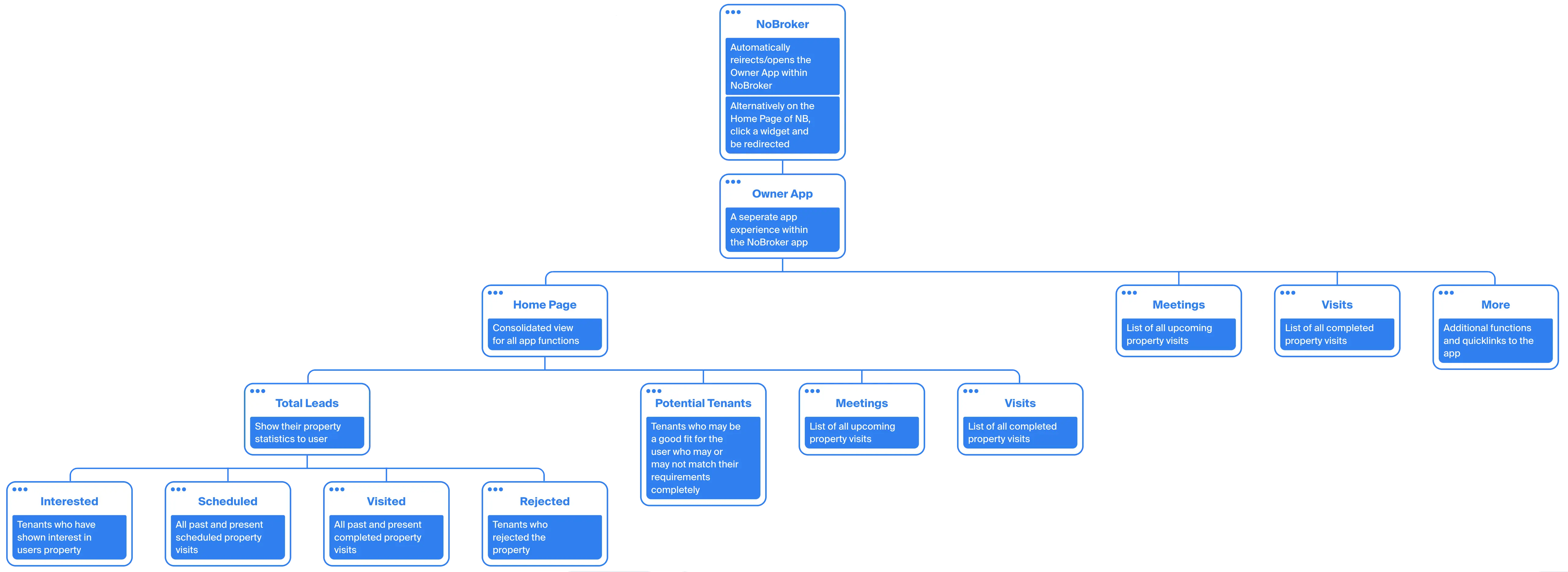
Information Architecture
The product's information architecture prioritised simplification, featuring a basic sitemap and straightforward terminology to ensure accessibility for users of all English proficiency levels. The focus was on keeping users on the home screen, where all relevant data, including potential tenants, visits, insights, and more, could be easily accessed. Additionally, separate spaces were designated to track visits and provide visit feedback, enhancing user experience and engagement.
A new footer is used, separate from the one used on the native NoBroker app, this one helps keep the users in the pages only relevant to them, since users are generally engaged in just this singular activity while on the NoBroker app.
Any update on chat would be conveyed to the user, keeping them engaged on chat and lowering their reliance on calls


Wireframing to Design
Wireframing proved instrumental during the app revamp, serving as a vital tool for persuading stakeholders, project managers, potential users, and design leads about the key features required to enhance usability and improve KPIs. This process facilitated rapid iterations, allowing decision-makers to pinpoint new issues in the problem statement. The insights gained were seamlessly integrated into the wireframes before finalising the design, ensuring a comprehensive and effective solution.

Initial wireframes of the home page, we wanted to show the users an overview of how their property is performing right from the get go.
Configuration was moved entirely into one section called settings
A brief overview of the main features in the app. The design was aimed at guiding the user down the right path in their journey. The app would grow and change as the user would progress in his renting out journey. The CTAs and card design would also change depending on which page to prioritise what actions and information is important for the user on their stage in their journey.
The Design

The home page acted as your main hub to do most of your activity. Users were spending most of their time on the home page to view the activity of their property or in many cases multiple properties.
On top you can swipe between your multiple properties to see the stats on each separately and communicate with the property specific relationship manager.
You can then see an overview of how your property is performing, all the important metrics which allow you to drill down further to know more.
The app using AI suggests potential tenants who would be a good fit for your home who could then be reached out by the user or can be asked to be contacted by the RM.
Afterwards comes a horizontal carousel which the user can scroll to see all the scheduled visits and the visitors of his property according to date.
The user can also see the latest completed visits and choose to take action on these tenants or even update any finalisation made.
Using AI a few insights are passed on to the user including tips about rent amounts, competitor properties and rejection reasons.
There is also a list of potential tenants who would be a good fit for the owner, these have been suggested by the RM.
At last there is the facility for the user to raise any disputes or complain about any problems to NoBroker directly and avoid users going to social media to feel heard.
Home Page
Upcoming Visits
View all your scheduled visits in one page. The cards are arranged from the earliest to latest visits.
On top you can swipe between your multiple properties to see the stats on each separately and communicate with the property specific relationship manager.
You can then see an overview of how your property is performing, all the important metrics which allow you to drill down further to know more.

Finalisation Screen
On confirmation of the token amount the user would be taken to the final screen.
The user would lose access to the rest of the app from this point for this property. They can chat with the RM if they wish. They can browse through other relevant services on NoBroker.
The services advertised to the user were relevant to owners which they may need post renting out their homes. Users usually would take these services anyway so this would be a convenient reminder for the user to avail these services. The services most used were home cleaning, home painting and rental agreement. Having the banners here also improved company KPIs and increased revenue in these services.

The Current App
The app exists on the NoBroker app as a paid service plan. Any user who has a property can avail it and take advantage of its features. Currently it has around 5,000 users a month and has a 95% closure rate with most of the properties being rented out in less than 2 weeks. Simplicities in the app design and improvement in tech has made the lives of the Relationship Managers far simpler and frees them up to handle more users with ease.

Completed Visits
View all your past completed visits in one page. The cards are arranged from the earliest to oldest visits.
The primary information to be brought out in the card was the name of the tenant and their current status of the tenant.
The CTA on the cards also changes based on the status of the tenant. The user has the option to reconsider a rejected tenant where the RM can help mediate with the tenant. The user can reject or confirm if they have closed a deal with an under negotiation tenant
My Learnings so Far
1. As much as we try to reduce the reliance on Relationship Managers for simple tasks, users still want to have that additional human element to rely on. Repeated use may help ease this issue but this would rely on users having multiple properties.
3. A good user experience and service for the user is key as most users branch into our legal services or rental agreement and move into our home services by taking home and bathroom cleaning which makes them regular users of the NoBroker app. Making sure entry points exist wherever most applicable facilitates this.
2. The app design has to be familiar to the old one so that users don’t feel too overwhelmed. The typical user is not a regular one, as properties often go up for rent on a minimum period of 11 months. This means the users aren’t regular users of the app.
4. Users when onboarding are very strict about their requirements for an ideal tenant, this leads to very few tenants who match their criteria making the user frustrated. Nudging them wherever possible to reduce their restrictions and showing them people out of their requirements is key to solving this issue.